WARPLab 7
- Downloads
Getting Started
- Sample Buffer Sizes
- Automatic Gain Control
- Examples
- Extending WARPLab
- Debugging Errors
- Porting Code
- Benchmarks
WARPLab 7 Framework
WARPLab 7 Reference Design
Reference Design Modules
- Node
Interface Group
Baseband
Transport
Trigger Manager
Hardware
WARPLab 7 Example: Spectrogram
File: wl_example_siso_spectrogram.m
This WARPLab example implements a simple receiver spectrogram and does not require any MATLAB toolboxes. While this example can run on any WARPLab 7 installation, it is intended for WARPLab 7.5 and above as those designs support much larger sample buffer lengths.
Detailed Description
As of WARPLab 7.5, the available size of the receive sample buffer is 128M samples for the 2RF design. This is 4000x larger than the 32k sample buffer sizes in WARPLab 7.4. For more perspective on that number, 32k samples at 40 Msps (i.e. 40 MHz of bandwidth) yields an entire buffer length 819 µsec. This is long enough for a reasonable length packet transmission, but not much more. With WARPLab 7.5, capturing the entire receive buffer yields a full 3.35 seconds of reception at the same 40MHz of bandwidth.
There are many usage scenarios where these expanded buffer lengths are useful. One such usage scenario is monitoring channel activity. With over 3 seconds of received waveform at a full 40 MHz of bandwidth, we can see a large extent of channel activity at very fine timescales (25 ns samples). One popular visualization of frequency content across time is known as a spectrogram. In this example, we will use this technique to visualize activity in the 2.4 GHz band.
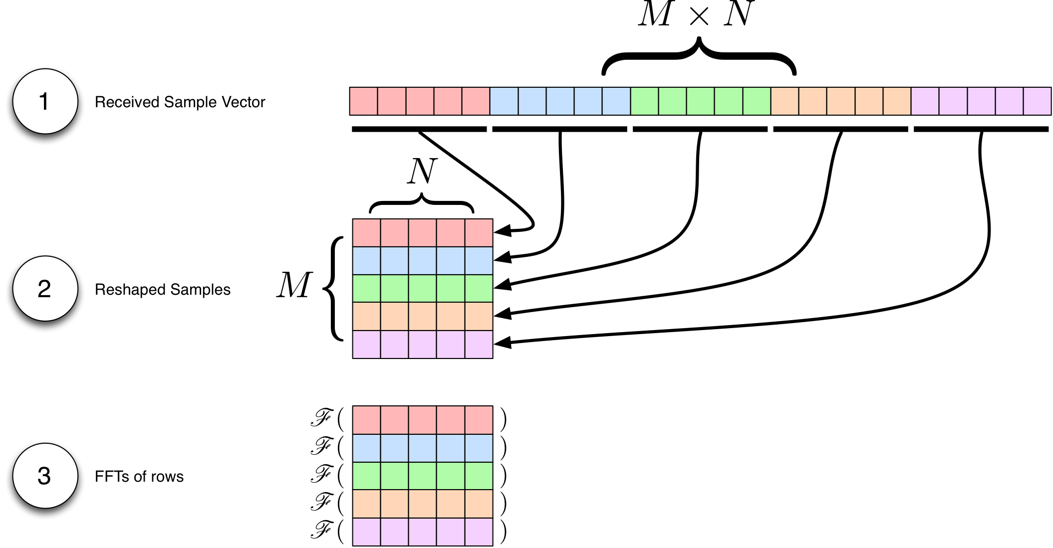
MATLAB offers a sophisticated spectrogram tool as part of the Signal Processing Toolbox. In this example, our simple implementation of a spectrogram does not offer the same advanced features like windowing or FFT overlap. Instead, our implementation works by simply plotting the magnitude of the output of M sequential FFTs of N samples each on a dB scale.

The above figure shows the three basic steps to the simple spectrogram in this example:
- The entire received vector of samples is treated as M sequences of N samples each.
- The vector is reshaped into a matrix of M rows and N columns
- An FFT for each of the M rows is performed. Each FFT is length N
For the purposes of this example, we have chosen to create a square spectrogram where M = N, but this is not a fundamental requirement. By breaking that inequality, you can choose to have higher resolution in the time or frequency domain at the expense of resolution in the other.
Example Outputs
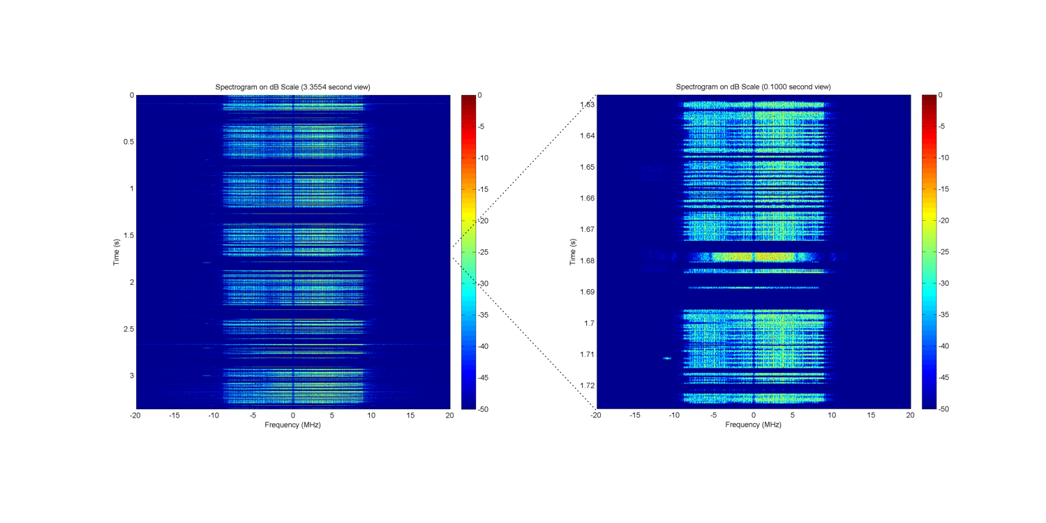
Case 1: No Active Traffic
For the first case, we investigate the channel activity without explicitly introducing any of our own traffic. We will take a spectrogram on channel 6, where there are a number of commercial Wi-Fi access points.

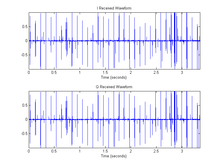
The above figure shows the raw, unprocessed I and Q samples from the receive buffer as a function of time. Over the 3.35 seconds of reception, it is clear that there is some sort of periodic source of energy on the medium with an interval of 100 ms. Beyond the presence of the periodicity, there is not much to conclude from this time-series plot.

The left subplot of the above figure shows the entire spectrogram of the received waveform. The periodic "bursts" of energy from the time-series plot show up as horizontal lines of energy in the spectrogram. In this view, we can see that the periodic energy bursts are approximately 20 MHz wide. At 100 ms intervals, there is energy that is 20 MHz wide. These are 802.11 beacons from our commercial Wi-Fi access point on channel 6. You can also make out beacons on neighboring channels from other access points. These access points are further away and their energy delivered to our receiver is attenuated by path loss.
The right subplot of the above figure shows the same data, but zoomed into a small 100 ms slice of the 3.35 s data. You can see that activity is recorded at a much finer granularity than is implied by the left subplot. There is much more data in the spectrogram than can be plotted at reasonable resolutions. In this example, the spectrogram is a matrix of size (M = 11585) x (N = 11585) -- far more than the resolution of the final plot.
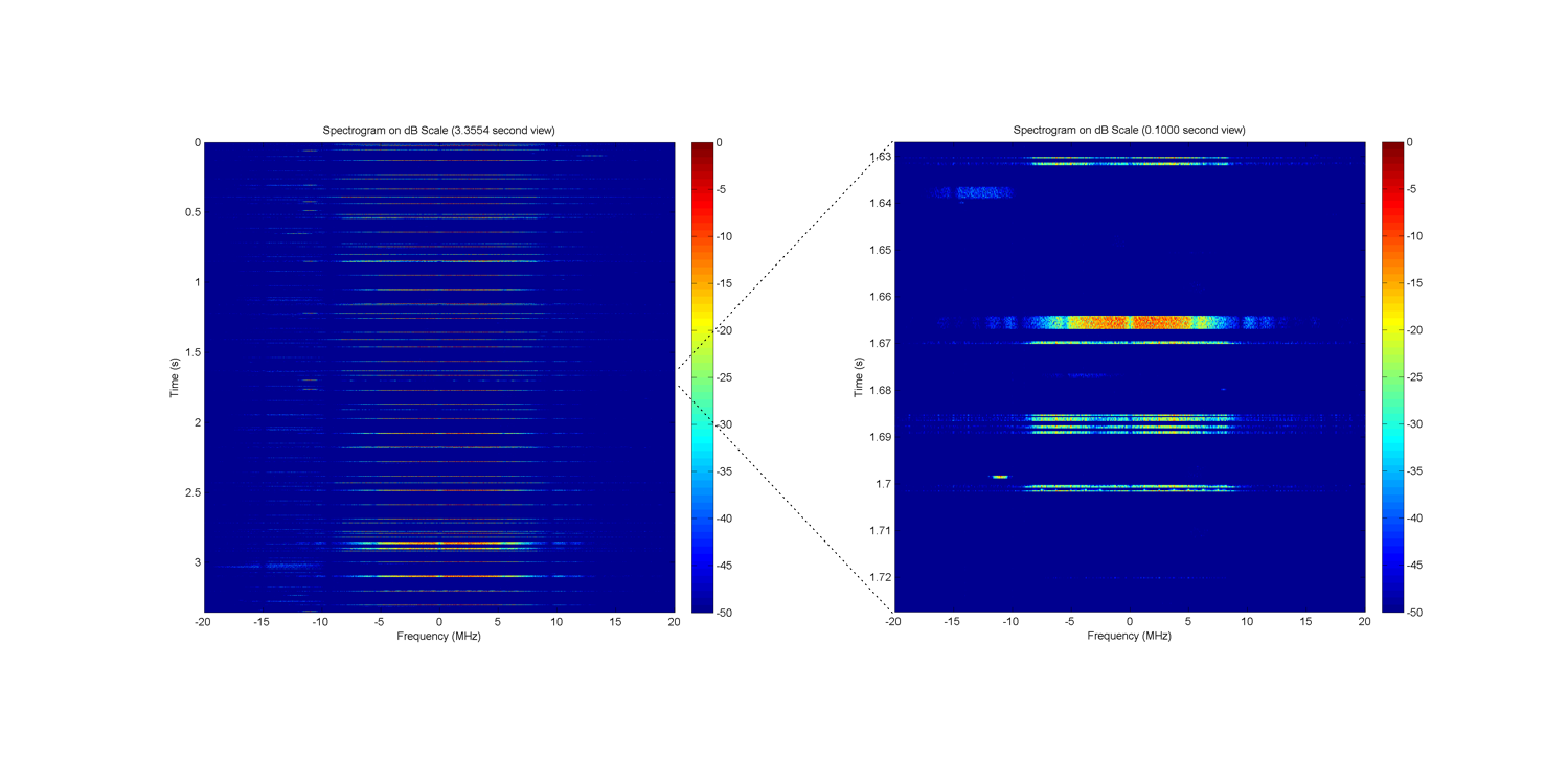
Case 2: Active Traffic Source
Finally, we investigate the channel activity when we are actively using the RF medium. Specifically, we are running a TCP speedtest on a smartphone via a Wi-Fi link with our commercial access point.

The above figure shows a marked increase in medium activity when the non-trivial Wi-Fi traffic is present. Even in the zoomed-in 100 ms view, you can see that there are many transmissions taking place. You can actually zoom in on the data even farther and explicitly measure constants defined by the 802.11 standard like the 16 µs SIFS period between a data transmission and its associated ACK.
Attachments (4)
- spectrogram_steps.png (175.2 KB) - added by chunter 9 years ago.
- wl_spectrogram_busy.png (633.8 KB) - added by chunter 9 years ago.
- wl_spectrogram_idle.png (289.6 KB) - added by chunter 9 years ago.
- wl_rx_timeseries_idle.png (7.4 KB) - added by chunter 9 years ago.
Download all attachments as: .zip